What Technical Analysis Can and Cannot Do
Technical analysis is a framework for defining risk and making repeatable decisions. It is not a prediction engine, and most of the disappointment in this field comes from being sold the second thing. This guide is part of our forex trading for beginners roadmap; for a full worked application of these ideas to one instrument, see our EUR/USD technical analysis method.
Here is the useful version of the claim. A price level identified from history gives you a place where your idea is demonstrably wrong. That gives you a stop. A stop gives you a distance in pips. A distance in pips gives you a position size — run the last step through the position-size calculator rather than rounding it in your head. So a chart level, correctly used, is the input to an arithmetic chain that ends in a number of lots — not a forecast.
What it cannot do: tell you which way price will go, survive a scheduled central bank release, or turn a strategy without an edge into one with an edge. Any of those claims should end your interest in the source making them.
Chart Types and What a Candle Records
A candlestick records four prices for one period: open, high, low, and close. The body spans open to close, the wicks span the extremes. A close above the open is conventionally green, below is red.
The reason candles beat line charts is that the high-to-low distance is the range you size stops against. A line chart of closing prices hides it entirely, and the range is the single most decision-relevant number on the screen. Bar charts carry the same four prices in a different visual form; the choice between them is preference, not information.
Trend Structure: Higher Highs and Higher Lows
Before reading any real chart, the two structural concepts below need names, because the walkthrough in the next section leans on both without re-explaining them.
The first is trend structure. An uptrend is a sequence of higher highs and higher lows — each swing high clears the last one, and each pullback finds buyers earlier than the one before it. A downtrend is the mirror: lower highs and lower lows, with each rally selling earlier than the last.
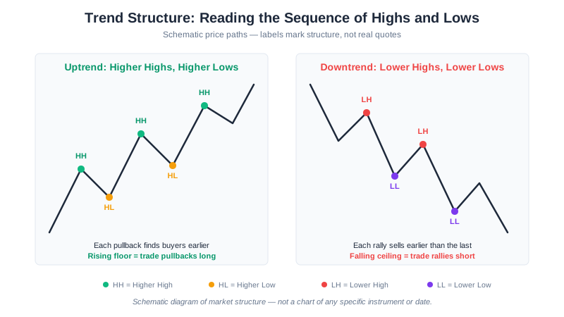
This is more useful than it sounds, because it replaces a subjective read (“this looks bullish”) with a checkable one: is the most recent low higher than the one before it, or not? That single question is the seed of Step 3 in the walkthrough below.
Support, Resistance, and the Polarity Flip
The second concept is the level itself, and the single most useful behavior a level exhibits: once broken, it tends to flip sides. A support level that price has bounced off repeatedly, once broken decisively, is often retested from below and rejected — the old floor becomes a new ceiling.
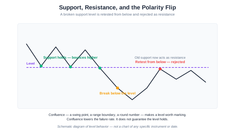
A level earns the right to be marked on a chart by having more than one reason behind it — a prior swing point, the edge of a known range, a round number with something else lining up alongside it. That combination is called confluence, and it is a filter that lowers the failure rate of a level. It is not a guarantee the level holds, which the real example below demonstrates directly. What counts as decisive is the part most chart reading leaves vague; our rule-based breakout blueprint turns it into confirmation rules and stop placement, and names the false-breakout case where the level flips back.
Reading a Chart, Step by Step
Abstract advice is easy to nod along to and hard to apply, so here is the procedure as a sequence you can run on tonight’s chart. Prices are written schematically — L for the level under discussion, with distances in pips from it — because the steps are what transfer, not any particular quote. The same notation and the full method are in our EUR/USD technical analysis guide, which is the pillar this page feeds into.
Step 1: mark the outer boundaries. Find the highest high and lowest low of the last few months and mark both. Everything between them can then be read as a position inside a known band rather than as a surprise each morning. Until those two prices are on the chart, “price is high” and “price is low” are opinions.
Step 2: keep only the levels with more than one reason behind them. A level at L earns its place by scoring on independent counts — a confirmed swing point, the boundary of the prevailing range, a round number, a matching level one timeframe up. Two or more independent reasons is confluence, and it is where you commit size. A lone trendline touch is not. The technical analysis guide’s scoring rubric puts point values on each reason so the decision stops being a feeling.
Step 3: read the sequence, not the indicator. After a break above L, look at the next several session lows. If they print at roughly L−10, L+8, L+21, L+17 pips — a rising floor that never gives back the whole advance — buyers are paying more each session. No oscillator is required to know that means trade pullbacks long, do not fade strength. (Those offsets are illustrative, not quotes.)
Step 4: name the polarity flip. Those same sessions are using the old L ceiling as a floor. That is the highest-value pattern in level trading, because it gives you a pre-identified entry zone rather than a chase — and a clean invalidation, since a close back below L ends the idea.
Step 5: accept that confluence is a filter, not a guarantee. A zone with three independent reasons behind it still breaks. Three reasons means it fails less often. It does not mean it holds, and sizing as though it does is how a sound method still empties an account.
What Each Indicator Gets Wrong
Every indicator is a transformation of past price. Each one has a specific, documented way of being wrong, and knowing the failure mode is more useful than knowing the formula.
| Indicator | What it is for | How it fails |
|---|---|---|
| Moving average | Encoding trend direction into something checkable | Lags by roughly half its period; whipsaws repeatedly in a range |
| RSI | Flagging momentum extremes at a level you already found | Sits above 70 through an entire strong trend |
| ATR | Sizing stops to current volatility | Says nothing whatsoever about direction |
| Support / resistance | Defining where an idea is wrong | Works because everyone watches it — until the day everyone is on the same side |
Moving average lag, with numbers. Take a consolidation 180 pips wide — a realistic band for a major pair over several weeks — with most daily closes clustered in the middle third. A crossover system inside that band signals near the middle, after the turn has already happened. Half the range is 90 pips, so a signal arriving 60 pips late leaves about 30 pips of usable move before the opposite boundary stops it — and that is before spread. Widen the band and the arithmetic improves; tighten it and the system is underwater on entry. That is why moving average systems bleed in ranges and earn everything back in trends. Moving average strategies covers the configurations.
RSI staying overbought, worked through. Take the rising-floor sequence from Step 3 above. A trader shorting the first overbought reading at the L+8 session watches price print higher lows at L+21 and L+17 and then run to a new high well above all of them. Sixty pips of adverse travel from the short entry is entirely ordinary in that situation, so any stop tighter than that is hit before the idea has a chance to be right. “Overbought” describes the speed of a move, not its remaining distance. In a trend, RSI above 70 is confirmation that the trend is working, not a signal to fade it.
ATR has no sign. An ATR of 18 pips tells you a 27-pip stop is 1.5× current volatility. It does not tell you whether to be long or short, and treating a volatility expansion as a directional signal is a common category error.
Support and resistance is self-fulfilling until it isn’t. Levels work partly because enough participants act on them. That same crowding is why stops cluster just beyond round numbers — a stop five pips under the nearest round handle sits in the obvious pool with everyone else’s, and sweeping that pool is a routine market behaviour, not a conspiracy. Place stops beyond the zone with a buffer, and size down to compensate.
The Multi-Timeframe Trap
Open enough timeframes and one of them always tells a bullish story. Inside any multi-week range, the M15 chart can show a clean downtrend nested inside an H4 range nested inside a daily recovery — three true statements, three different trades, and a trader who takes whichever one agrees with the position already open.
The rule: nominate one decision timeframe before you open the chart, in writing. The higher timeframe supplies directional bias only, and acts as a veto rather than a signal. The lower timeframe supplies entry timing only, and never generates the decision to trade. If the H4 says no and the M15 says yes, there is no trade — that is the whole point of having written it down first.
From Chart Reading to a Written Rule
An observation is not a strategy until it has an entry, a stop, a target, and an invalidation. Take the observation from Step 3: price broke above L and used it as support for four sessions, the deepest of which dipped to L−89 pips. The period high sits at L+63.
Version A — invalidate at the structural low. Entry on an H1 close at L+10. Stop ten pips below the deepest consolidation low, at L−99. Target the period high at L+63. Risk is 109 pips, reward 53. That is 0.49:1 — a bad trade, and writing it down is what revealed it. Nothing about the chart changed; the arithmetic did the work.
Version B — invalidate at the level itself. Same entry at L+10. Stop at L−20, twenty pips below the polarity level. Same target at L+63. Risk 30 pips, reward 53, so 1.77:1 — a ratio that breaks even at a 36% win rate. Invalidation: an H1 close back below L.
Same observation, same chart, two rules — one worth taking and one not. The difference is entirely the choice of invalidation, which means choosing the invalidation is the trade. Writing it out before entry is the only reliable way to find out which version you are actually in.
The chart above is live EUR/USD on the daily timeframe. Every price in this guide is schematic notation rather than a quote or a forecast — L is wherever your own level turns out to be. What transfers is the procedure: mark the boundaries, keep only levels with a stated reason, read the sequence of highs and lows, and define invalidation before entry.
That written rule is also the point where analysis becomes automatable. An entry condition, a stop distance, and an invalidation are exactly what an Expert Advisor needs to execute a plan without hesitating at 3am — and exactly what it cannot supply for you. Automation removes execution error, not analytical error. To try the same rules on demo first, open a free XM account .
Build on This Guide
- EUR/USD Technical Analysis Guide — the full method, including the confluence scoring rubric this page draws on
- Moving Average Strategies — configurations and their range behaviour
- Forex Risk Management Guide — turning a stop distance into a position size
- What is Forex Trading? — pips, spread, and the mechanics behind the chart
- Backtesting Guide — testing a written rule before it costs money
This article is for educational purposes only and does not constitute financial advice. Price markers such as L are schematic notation used to demonstrate arithmetic — they are not quotes, records of past prices, or forecasts. Past performance is not indicative of future results.

